

WARHEADS

PROJECT TYPE
Branding & Packaging
Branding & Packaging
CLASS
Packaging Design
Packaging Design
TOOLS USED
Adobe Suite
Adobe Suite
Warheads has been the face of sour candy for decades. This semester-long project aimed to take what they are known for a sour, explosive, fun personality and turn it into a completely new visual system for a younger generation. My packaging drew on Warheads' current visual language, graffiti, contemporary illustration, and fruity mascots to create a product that looks daring and full of intense flavor.

STARTING SOMETHING SOUR
After polling over 30 people from a variety of demographics, I found that Warheads needed packaging that was loud, easy to understand, and better at communicating the flavors inside.
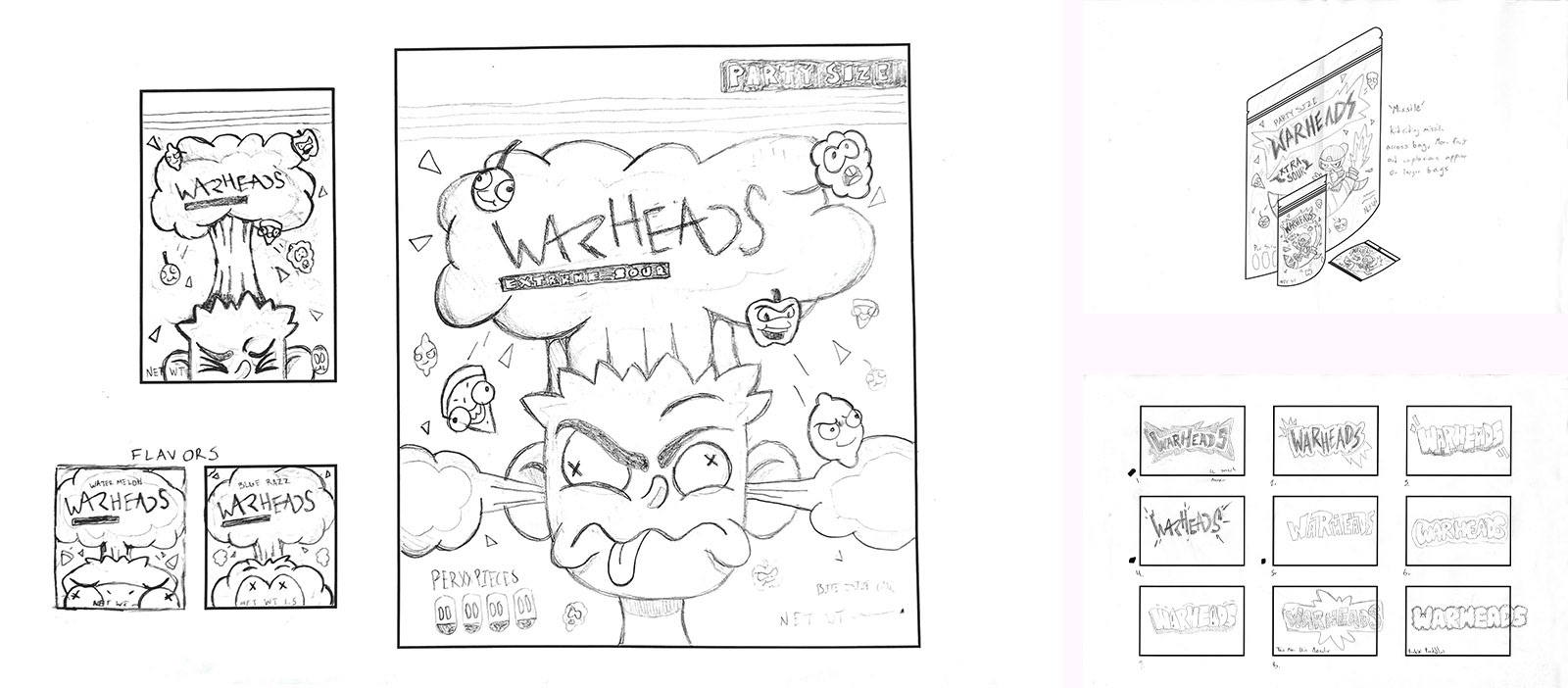
I began exploring illustration and lettering styles that stayed true to the original's grungy aesthetic while feeling cleaner and more pleasing to look at. This led me to artists like Vexx, Gawx, and Edgar Rozo, whose work shares traits with retro comics and graffiti. These art forms have a similar tone to Warheads while feeling cleaner and more inviting to the children who make up the brand's primary demographic.
My thumbnail directions focused on creating memorable characters, like the brand's official mascot, Warhead Wally, and making them the star of the packaging. This would make the designs feel more playful while showcasing the flavors of the actual candy. My professor and I ultimately settled on a direction that reimagined Warhead Wally in an updated style, made him the star of the packaging, and housed an updated wordmark within a more obvious explosion, alongside new fruit mascots. We chose this direction to keep the brand familiar while communicating a literal and metaphorical explosion of flavor.

POLISHING UP THE PACKAGING
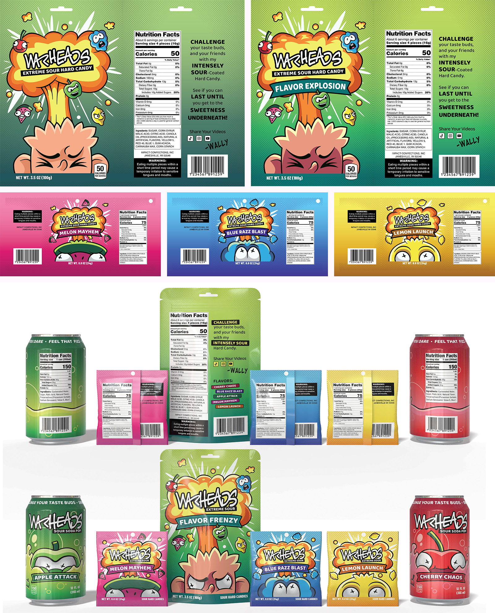
With the direction settled, I began vectorizing the designs and making adjustments based on feedback gathered from in-class critiques. I focused on developing the bag and pouch packaging first, so I could refine the visual system before applying it to the Warheads Sour Soda product line.
Most of the feedback involved adjusting colors, typography, and illustrated details to ensure the packaging met the project goals. This led to a system of loud and funky illustrated characters supported by simple typography and halftone patterns, an energetic but consistent visual system that was carried across multiple products.

AN EXPLOSIVE EXPERIENCE
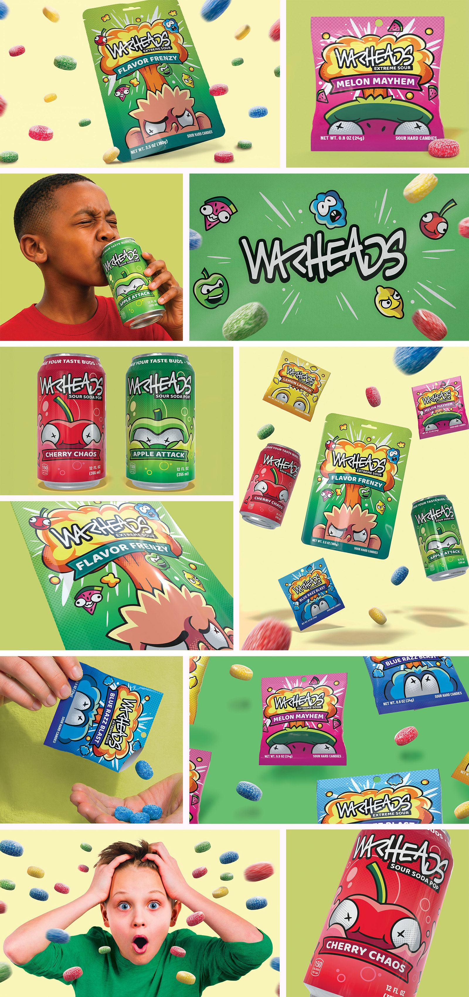
The project ended with the creation of final mockups and images to showcase the system. I focused on curating photos that kept the high energy of the brand and the new packaging I designed for it. Dynamic compositions, intense facial expressions, and flying candy all come together to make sure the brand never feels boring.

VIEW MORE OF MY WORK